The saying goes that you shouldn’t judge a book by its cover, but I do. I judge albums and EPs by their art and let me tell you why.
 First of all, I don’t want to come across as shallow but I do have a strong sense of aesthetics. I like pretty things: glitter, flowers, and art.
I also like other things that are pleasing to the eye, for example, “good” graphics in video games. Now some people would say that the graphics alone don’t make a good game and I agree, but it gives me a great deal of pleasure to be able to look at something beautiful while I’m playing for hours at a time.
So I apply the same thing to music. I like artistic covers, especially ones that fit the music absolutely perfectly. Listening to the music and seeing it come to life via the cover that the artist created for this specific purpose makes my heart flutter and my head dream.

(Purity Ring – another eternity: looks like it sounds)
Artists should convey the feeling of their music with the album covers. Some bands choose not to do so on purpose. I believe, however, that it is important to deliver what it says on the tin because of people that listen to a lot of new music on a regular basis: gatekeepers, like me.
I am regularly (for about 3-4 months every year) swamped with hundreds of artists that want to be listened to when I work on artist applications with Liverpool Sound City Festival. It gets tiring if you have 10 bands that are equally good but you can only choose 3.
A good cover is a tool to decide which band has made the most effort. I only have a little bit of time for each band, so standing out is key.
I obviously also apply this in private when browsing through my recommended section on Spotify. During work, I don’t have the time or patience to listen to every single band or song it recommends so I go with the gut feeling I get from the cover. And most times I’m right.
I actually wrote an essay about my own EP when I was in university in which I touched upon the aesthetics of album art. Let me quote myself:
I came upon an article and photo gallery titled “Indie Album Covers: Once You See The Trends, You Can’t Unsee Them”. Designer John Smith found that “the ‘hipster’ scene now associated with indie music has an emerging aesthetic that blends ’80s, vintage themes and colors with a DIY vibe and adds in quirky abstractions (…) This would explain the vibrant colors, dreamy abstract visuals, and a less-polished, non-corporate finish on the covers.”
I too noticed a high occurrence of geometric objects and soft colours featured in many of the covers. Combined with my own observations of illustrations and animals featuring often, I combined all these findings into my own (…)

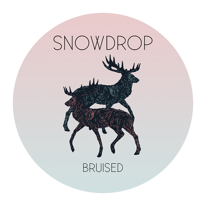
SNOWDROP – Bruised EP: did I do this right?
Different styles of music usually employ a certain style of cover art. Which is helpful for me personally as I can usually tell what bands might sound like just from their album covers. For bands, it’s another opportunity to sell themselves, to stand out. This whole notion might have been even more important before the rise of the internet, as now songs are easily available to listen to before you buy.
Have you ever judged music
by the cover art?

